ShopDreamUp AI ArtDreamUp
Deviation Actions


Description
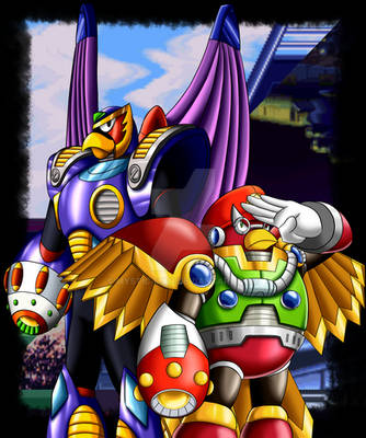
And once again I am one step ahead of that puzzle battle junk. Not going in any particular order with these guys, just a random shuffle. But seriously, MetalMan naturally has to come first, even if he does grab himself down there like that... His gears of glory/discs of doom/saws of slaughtering are TOPS. ...Though on his pixely head it looks more like a doctor's light. I think I fancy him more as a surgeon than a dentist that way.
I have to be honest that some of these guys seemed tricky to "depixelate" at first. BubbleMan is a pretty good example; you know how his 8-bit sprite barely resembles his official artwork? At first I was all like "screw it" and tried making the new sprite for him look more like his artwork self, but I couldn't get it to stick. Then I saw what this guy did here -> [link] and took his word for it. The key wasn't to add more detail within the proportional parameters, but to make the details that are already there more definable. ...I'm not sure if that jibber-jabber made sense, but whatever.
_ _ _ _ _ _ _ _ _ _ _ _ _ _ _ _ _ _ _ _ _ _ _ _ _ _ _ _ _ _ _ _ _ _ _ _ _ _ _ _ _ _ _ _ _ _ _ _ _
Ever since the beginning of the end of the 8-bit era, Capcom has made one attempt after another to give their mascot a new coat of paint, but for some reason, none of them could even come close to being as good as the original NES titles. It seems like you can't have a good Mega Man game without having a bunch of bug-eyed, big-headed, stubby-handed little people frolicking all over the place... and are actually able to outrun freaking bullets! ...with their BUTTS. It's so dorky and it completely defies the laws of physics, and yet that's what makes the series so awesome somehow. The better reason they went back to that style in 9 and 10. I would pretty much desribe it along the lines of dorkily awesome and awesomely dorky.
Anyways, I kind of got an idea for this thing after I saw some videos for Mega Man Universe. What they're essentially doing is basically sucking out all the "squareness" while retaining the 8-bit feel from the glory days. I'm kind of doing that here too, but I'm more leaned towards a full blown 2-D standpoint rather than 2.5-D. It's a style I like to call ∞-bit. It's like a version of 8-bit that shows about as much detail as a bunch of tiles could, but has a much smoother way of doing so by far.
Knock yourself out.
Disclaimer just to be safe: Characters belong to Capcom blah blah blah. That should be pretty obvious.
Image size
2160x14400px 1.61 MB
© 2011 - 2024 WaneBlade
Comments31
Join the community to add your comment. Already a deviant? Log In
Are these vector traced? How are the lines smoothed out